
We’ve all been there landing on a website that feels flat, cold, and transactional. It might be perfectly designed, technically flawless, and mobile-optimized but it doesn’t feel like much.
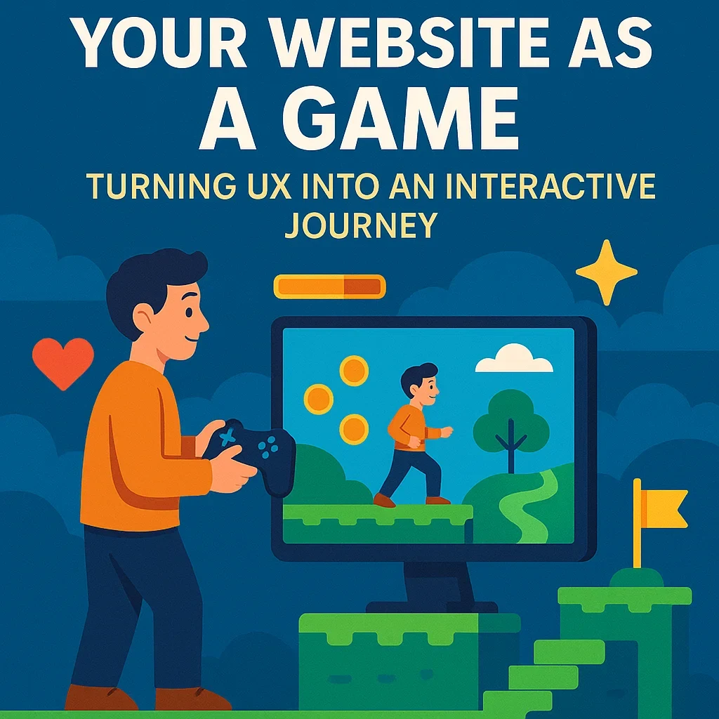
Now imagine landing on a site that feels like an experience. Where each scroll feels like progress. Each click brings you closer to discovery. Where the interface reacts, rewards, and engages.
This is where UX meets gamification. And it’s not just fun it converts.
What If Your Website Felt Like a Game?
Let’s be clear: we’re not talking about turning your site into Candy Crush.
We’re talking about infusing game-like principles into your design. A journey that pulls visitors in, encourages interaction, and builds an emotional connection with every move.
Because in a world where attention spans are fleeting and competition is brutal, a static site simply won’t do.
People want to feel something.
They don’t just want to browse. They want to explore. And when your site feels like an adventure, they stay longer, click more, and come back.
The Psychology Behind It
Games work because they trigger fundamental human drives:
- Progress: We like seeing how far we’ve come.
- Challenge: We stay engaged when we’re asked to act.
- Rewards: Even a small win keeps us coming back.
- Exploration: Curiosity fuels movement.
The same elements can be woven into web experiences using smart UX design. This is where (keyword) becomes crucial.
With (keyword), you gain insight into how users move through your site, where they stall, and what keeps them engaged. That data can shape a layout that doesn’t just look good but feels alive.
Micro-Interactions = Micro-Delight
Let’s break it down: it’s the little things that make your site feel interactive.
Think:
- Progress bars that fill as a user completes steps
- Badges or animations that trigger after an action
- Quizzes or tools that respond instantly to input
- Unlockable content after scrolling a certain depth
- Subtle sounds or motion to reward actions
These are known as micro-interactions, and when done well, they mimic the satisfaction of leveling up in a game.
It’s no longer “read this, click here.” It’s “what happens if I…?”
And that shift makes all the difference.
Case Study: Duolingo Mastering the UX Game
Language learning isn’t easy. But Duolingo made it addictive.
Their UX is designed like a game with daily streaks, XP points, leaderboards, unlockable lessons, and positive reinforcement from characters and sounds.
Here’s the genius: it’s not just fun it’s what keeps users coming back. Duolingo turns a tough task into a playful, rewarding journey. Users are nudged, not pushed. Encouraged, not pressured.
The results?
✔ Over 50 million active users
✔ One of the highest engagement rates in edtech
✔ A UX model many brands now try to mimic
This is what happens when your website feels like a journey not just a brochure.
Using (Keyword) to Map the Journey
A game doesn’t just happen. It’s built on structure levels, paths, and logic. The same goes for your website.
Using (keyword), you can:
- Identify which pages get drop-offs (and where the “game” breaks)
- Understand what keeps users clicking (your best-performing quests)
- Test different interactive elements (buttons, scroll triggers, pop-ins)
- Refine CTA placement based on behavioral cues (timing matters)
Think of (keyword) as your map designer. It tells you where people are, where they’re stuck, and how to lead them forward.
Not a Gimmick A Strategy
Gamified UX isn’t just about bells and whistles. It’s a way of thinking.
Here’s how to implement it in a way that adds value not clutter:
🎯 1. Set Goals Like a Game Designer
What’s the “mission” on each page? Is it discovery? Conversion? Education?
Define the objective and reverse-engineer the path.
🧩 2. Break It Into Steps
Gamification thrives on momentum. Break big actions (like filling a form) into smaller, bite-sized steps with visual progress.
✨ 3. Reward Micro-Actions
Even a thumbs-up icon, a color change, or confetti animation makes the experience feel responsive.
🧭 4. Let Users Explore
Avoid linear, one-size-fits-all journeys. Let people choose paths (like quizzes, guides, or personalized navigation).
🔄 5. Keep Iterating
Test, learn, and tweak. (Keyword) analytics help you adjust in real time, just like a game patch would fix friction.
Brands That Are Playing Smart
It’s not just Duolingo. A few other brands that have mastered gamified UX:
- Nike: Their Run Club app uses levels, badges, and streaks to turn exercise into competition.
- Canva: Easy onboarding that feels like a guided mission with quick wins.
- Codecademy: Progress dashboards, skill trees, and XP to motivate coders to keep learning.
They’ve all figured out the same thing: when users are active participants, they feel connected—and that turns into loyalty.
The Risk of Over-Gamification
A word of caution: gamification should serve the user, not overwhelm them.
Don’t turn your homepage into a pinball machine. Focus on meaningful engagement. Not everything needs a score or a badge.
Balance fun with function. Guide, don’t distract.
At the core, your site still needs to answer: What’s in it for the user? Gamified UX simply makes that journey more memorable.
Final Thoughts: Play With Purpose
Your website isn’t just a digital business card. It’s an experience, a playground, a stage. The more it feels like a story the user can play through, the more likely they are to stay and convert.
Treat UX like game design, and you’ll start seeing everything differently:
- Navigation becomes a quest.
- CTAs become choices.
- Scrolls become steps.
And your audience? They stop being visitors. They become players with a reason to keep coming back.
In the end, that’s what every great brand wants: not just traffic, but engagement. Not just users, but fans.
And that’s exactly what happens when your website becomes a journey worth taking.