
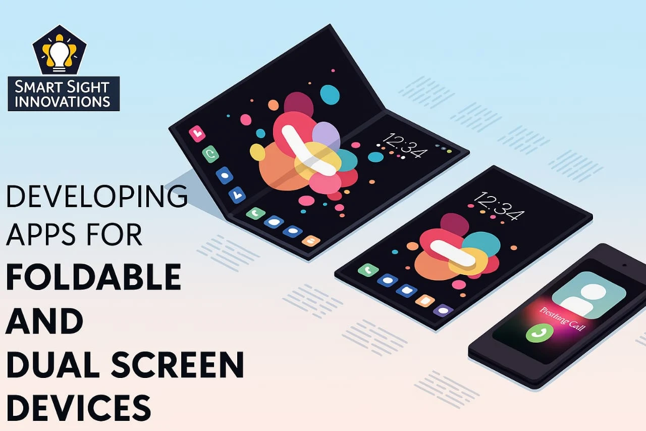
We’ve come a long way from single-screen desktops. Today, with the rise of foldable phones, tablets that double as laptops, and dual-screen laptops, the way people interact with the web is transforming fast and quietly.
Yet many web apps still assume a flat, static viewport. That assumption no longer holds.
Why Foldables and Dual Screens Matter
Foldables and dual-screen devices aren’t just a novelty anymore. From the Samsung Galaxy Z Fold to Microsoft’s Surface Duo, they’re carving out a new category of user behavior multi-context usage.
Think about how users interact with these devices:
Reading on one half, typing on the other
Video calling on the top screen, taking notes below
Comparing two browser tabs side by side
These aren’t futuristic ideas they’re real use cases today. And if your web app isn’t built with them in mind, you’re already behind.
Understanding the Challenges
When designing for foldables and dual-screen devices, it’s not just about resizing content. You’re working with:
Multiple viewports
Unusual aspect ratios
Hinges or folds that may cut content visually
Posture shifts (book mode, tent mode, tablet mode)
A one-size-fits-all responsive layout won’t cut it. You need a context-aware design that adapts dynamically based on screen posture and span.
The Key Principle: Intent-Aware Design
The goal is to match the device’s physical behavior with the user’s intent. On a foldable phone opened flat like a tablet, a user might expect a two-pane layout similar to what they’d get on a desktop. When the device is folded, a more condensed, scroll-based design is appropriate.
Designers must anticipate how users might hold or place the device and adapt accordingly.
Case Study: Redesigning a Productivity App for the Surface Duo
Case Study: QuickJot’s Foldable-Friendly Makeover
QuickJot, a lightweight, Markdown-based note-taking app, was built for browsers—but foldable users on Microsoft’s Surface Duo found it clunky. Content stretched awkwardly across the hinge, disrupting usability.
The fix?
The team applied the @media (spanning: single-fold-vertical) query to detect dual-screen usage. They redesigned the layout:
- Left screen: notes and folders
- Right screen: editor
When the device folded, the layout collapsed into a single-scroll view, with gesture support to switch modes.
The results:
✔ 42% increase in session time on foldables
✔ App rating jumped from 3.6 to 4.5
✔ 18% of users cited dual-screen optimization as the reason for upgrading to Pro
The takeaway? They didn’t just adapt—they reimagined the experience for a dual-screen world.
Why it worked:
The team didn’t just resize. They reimagined the user journey for dual contexts understanding that these devices aren’t just two screens, but new behavioral canvases.
Design Guidelines for Foldable Web Apps
If you’re building a web app today, it’s smart to start thinking with a foldable-first mindset. Here are some best practices:
1. Use CSS Media Queries for Device Posture
Foldable devices support posture-based media queries like:
css
Copy
Edit
@media (spanning: single-fold-vertical) {
/* Adjust layout for dual screens */
These allow you to shift layouts based on the fold orientation.
2. Avoid Content in the Fold Area
On dual-screen devices, a physical gap (the hinge) may cut into your layout. Always test for:
Button placement
Split images
Overlapping UI elements
3. Split for Purpose, Not Just Aesthetics
Don’t just divide your UI because you can. Use the second screen with intention. Examples:
In an email app, preview on one side, compose on the other
In a calendar app, day view on one screen, week on the other
4. Embrace Progressive Enhancement
Not all users are on foldables. Your app should still function well on a single screen. But those with multi-screen capabilities should experience a richer, more tailored interaction.
5. Think Like a Product Designer, Not Just a Web Dev
This shift requires a mindset change. Instead of just building to fit a frame, think of how the frame changes the task flow. What can users do better because of the second screen? That’s where the real innovation happens.
Tools That Help
Microsoft Emulator for Surface Duo Test dual-screen behavior
Chrome DevTools Device Emulation – Simulate foldable layouts
Feature Queries & JavaScript Use window.getWindowSegments() to detect screen segments and customize layout
The Business Case: Why You Should Care
Sure, foldables are still a niche but not for long. IDC predicts foldable phone shipments will hit 48 million units by 2026, and dual-screen laptops are gaining popularity among creative professionals and remote workers.
Designing for these devices early gives you:
A first-mover UX advantage
Better app stickiness for tech-savvy users
Future-proof architecture
Think of it like mobile optimization in 2010. Those who adapted early reaped the SEO and user loyalty rewards. This is the next curve.
Wrapping Up: Design Beyond the Rectangle
Web apps no longer live inside a single screen. They live across contexts, postures, and interactions. As foldables and dual screens blur the lines between device types, your designs must break free from fixed layouts.
Whether you’re building a note app, a shopping experience, or a collaboration tool, the future isn’t just responsive—it’s context-aware.
Design for where the user is and how they’re holding their world.